Aug 3, 2020
Why Your Website Should Be Responsive?

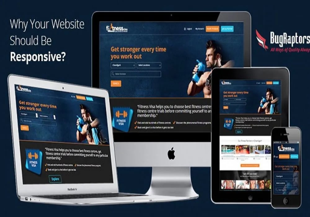
A responsive design responds to different display sizes by changing the size and layout depending on the device.
The main benefit is that mobile users will receive essentially the same experience of your website as your desktop visitors.
Responsive web design is becoming gradually more popular and many large companies have started to take this approach. Near the end of 2012, Microsoft released a redesign of their commercial website.
Why Are Responsive Web Design Important for Your Business?
Before we go for the reasons about the benefits of responsive web design, let’s understand why they are important for a business. There are some points you might like,
- It increases the reach of your website as you will be automatically targeting all types of devices.
- When you cater to your user with a consistent design, it increases the chances of lead generation and sales for your business.
- The maintenance costs reduce significantly.
- You stay ahead of your competition. (Over 44% of the top 500 fortune companies are still not mobile-ready)
Why Your Website Should Use Responsive Web-Design?
1) Cater To Savvy-Users:
Delivers a high-quality experience, no matter which device is used by the user. Prevent site drop-offs that tend to happen when the site is not usable and difficult to navigate.
Improve customer experience through all available channels.
2) Consistency in Branding:
Provide strength to your brand by providing the same style, look & feel, properly configured to all screen resolutions as your website looks on the desktop.
Responsive Design capitalizes on the essential differences in how each device is used by a user. Consistent doesn’t mean similar.
3) Search-Engine Friendly:
Responsive sites tend to be engaging and generate more clicks across different platforms.
Prevent diluting your content’s ranking in search engines. Avoid repeating any content managing between mobile and non-mobile websites.
4) Technical Efficiencies:
i) Only one website should be kept up, overhauls and changes are fewer mistakes inclined.
ii) Eliminate the requirement for specific tablets and smartphones.
iii) Save time and cash by bringing extra overhead required down to oversee diverts.
iv) Easily deal with all segments of the website.
5) Optimized Conversion Rate:
It keeps the website features and processes retained across all platforms.
Amplify the value of features.
Best practices are followed for each device so you don’t have the risk to lose the website traffic, visitors and business.
Also Check out our Case Study on Yielding Test Architecture Quality for a US based Technology Firm.
Click here for a quick read.
6) Mobile Users:
Users are now spending more than 1 hour per day accessing the internet from their mobile devices. One in four adults visits websites from 4 different devices each week.
Consumers generally have high expectations of their mobile experience. They prefer to access the websites from their smartphones as compared to their PC’s, with 67% of those surveyed expecting websites to be tailored to mobile phone usage.
7) Better User Experience Is a Key:
If a user launches your mobile website and doesn’t see what he is looking for or gets frustrated, there’s a 61% chance they will leave your website and go to another website (according to Google’s Think Insights on device).
As per the surveys, it shows a positive experience with a responsive website a user is 67% more likely to visit and buy a product or use a service from the website.
8) Always Keep You Ahead In Competition:
It means you have a great opportunity to distinguish yourself from the competition.
Statistically, almost half of your competitors could have un-optimized websites.
Further, a huge chunk of those who have applied responsive design is doing a pretty poor job of it.
Optimized your website for mobile is a simple way to instantly gain an advantage.
9) Mobile Visitors from Social Sites:
If you’re heading toward placing marketing, blogging and social media content on your website, you have most likely been seeing increased mobile traffic.
According to different surveys done by various sites that 56% of social media usage is through smartphones.
10) Google’s Recommendation:
Google recommends Responsive Web Design (RWD) is the best way to target smartphone users, and also favours mobile-optimized sites when producing results for searches performed on a mobile device.
From an SEO perspective, a single website is the best option.
Separate mobile websites have their own code and URL. Whereas, responsive websites use only one set of pages and files and one URL.
Thus, making it simpler and more efficient for the Google search engine to crawl, index and organize content and avoid issues of duplicate content.
Conclusion:
BugRaptors rely on that there are no shortcuts to success. A product must work perfectly, without exceptions, if it hopes to succeed. But that’s easy to say than doing it.We help you realize that dream by taking care of the tedious responsive testing and quality assurance process for you. Our team of experienced testers will perform responsive testing on your product to find out the bugs related to responsive design.